First, a definition: in the observations on this page, I'm referring to tricolor gum printing in its traditional sense: a print consisting of three or more layers of gum bichromate, most often (but not always) printed with color separations, and most often (but not necessarily) printed in primary colors to produce a more or less realistic color representation.
More recently, a kind of hybrid tricolor printing has become popular, incorporating cyanotype as one of the layers and gum as the other two layers. These prints have sometimes been mistakenly called "tricolor gum prints" resulting in some confusion. Those wishing to learn about this hybrid tricolor method are advised to consult Sam Wang's article on unblinking eye for information, or to see some great work of this type, search for Jim Larimer's outstanding gum over cyanotype work, which can be found at http://larimerphoto.blogspot.com. But on this page, we're talking about traditional tricolor gum prints. There's a significant difference between tricolor gum prints, where all the tonal structure is provided by gum layers, and gumover printing, where a significant majority of the tonal structure is provided by the underlying printing of another process. I'm not saying one is better or more legitimate than the other, I'm just saying they're different, and the discussion here is specific to the one type.
The interdependence of layers in tonality and color balance:The first thing to understand about tricolor printing is that tonal scale and color balance cannot be determined by considering each layer by itself, but only by considering the three layers in relationship to each other. People who come to gum from other photographic processes tend to spend a lot of time developing curves and profiles for each individual color, thinking that doing so will result in a perfectly color-balanced and tonally accurate color print, but in my observation this approach rarely produces the desired result, since the final result is created by a complex interaction between the color layers. For example, many people who calibrate the layers individually find that their tricolor gum is too dark, because they've used a pigment concentration that looks "good" when printed by itself, but three such layers adds up to too much density. Below is an example of such a result; three color layers calibrated to look good in individual printings, create too much density when layered in a tricolor. In general, my mixes for tricolor have much less pigment, even down to half as much as my mixes for monochrome work, for this reason, and still get good darks in the shadows by the accumulation of pigment density from the three layers.
Like any other gum print, or photograph, there's no "right" print tonal scale for a tricolor gum as far as I'm concerned; gum can be printed in a deep, middling, or high key, or covering a long and full tonal scale, depending on the needs of the image and the artist's aesthetic goals for the image. I've printed tricolors in many value ranges, as can be seen in the gallery, and have no patience with the idea of an "ideal" print tonal scale for any type of photograph. But I think it's worth noting here that while the tonal scale we can print in one printing is somewhat limited (as explained on the page on gum and tonality), with multiple printings (including of course tricolor) we have the ability to print a longer and fuller (meaning good detail and tonal gradation throughout all parts of the range) tonal scale.
What's confusing is that different people have different ideas of what constitutes a full tonal scale, apparently; for example a tricolor print I saw that was claimed by its maker to be printed the "right" way and to reflect a full tonal scale, actually had only midtones with no shadows or highlights to speak of, resembling a typical short scale for a one-coat gum print, say .75 -.25 reflection density. If there had been good detail in the highlights, then one could suppose that the print had been made with very little pigment so as to produce no dark tones. But that wasn't the case; there were no highlights to speak of, leaving me to conclude that curves were constructed to keep all the values in the midtone range, rather than the tonal values being lightened by lightening the pigment concentration. As I said, anyone can print gum in any value range they like with my blessing, but I can't agree with crowning one particular kind of tonality, especially one with an artificially limited print tonal scale, as a "superior" way to print tricolor. There's no such thing, only what works best for your particular purpose.
One can choose from a wide array of yellows, reds, and blues, but while each combination of pigments will give you a more or less believable color picture, each combination of pigments renders a different color "palette." My favorite pigment combination during the years I was printing a lot of tricolor was PY110, PR 175 (Daniel Smith Deep Scarlet) and ultramarine blue (PB29). I was in full flight from Kodacolor hypersaturated colors when I came to gum, so I have really enjoyed the softer, more unsaturated palette of this combination. Almost all of the prints in the tricolor gallery were printed with that combination. (Exceptions: leeks and radishes, and apricots, which both use pthalo blue. In the case of the apricots, I chose the phtalo because for this particular print I wanted the brilliance that phalo can lend to a print, whereas I usually prefer duller, more unsaturated colors; in the case of the leeks and radishes, I chose the phtalo to show how the greens made with pthalo seem unnatural to my eyes, and that's why I tend to choose a different blue when printing natural subjects like leaves/landscapes.) So pigment choice in each case is very subjective and dependent on subject matter and on aesthetic preference.
As explained in a section below, the only way to reproduce all the hues in the spectrum is to print six layers with six colors (primaries plus secondaries), but most of us aren't interested in being that precise about color reproduction. However, you do need to be aware, if you're planning to stay with three colors, that the principles described below dictate that different combinations of three primary pigments will render the secondary colors (orange, purple, green) very differently. Some combinations make gorgeous purples but somewhat ooky greens, some make lovely greens but muddy violet/purples. The best way to determine how colors will mix, short of physically mixing them or printing them, is to compare their reflectance curves; pigments sharing peaks in a particular part of the spectrum should mix well in that part of the spectrum. However, the mixing capabilities need to be balanced with other considerations, for example: PY 184, bismuth vanadate yellow, has a reflectance curve suggesting excellent mixing capabilities with both reds and blues (in other words should produce both viable oranges and greens). However, PY 184 is highly opaque, so I wouldn't choose that pigment because I prefer using transparent pigments. Another example: PR 209 and PV19 gamma have similar reflectance curves, indicating good mixing potential to produce secondary colors, but their different hue ranges mean that each of them will combine with different yellows and blues to produce a neutral color balance. And so forth.
Color Balance and Neutrality: Color balance and neutrality are inextricably linked and overlapped; if the colors are properly balanced, the three colors when given equal exposure should add to a neutral grey/black. Controlling color balance/neutrality, in my experience, is a matter of pigment choice and pigment concentration choice. There are those who insist that color balance and neutrality can be controlled using curves, and I think that's possible theoretically, though much more difficult than controlling it by adjusting pigments. But I've seen little actual proof that it works practically as well as theoretically, in fact some prints that were presented to prove the worth of a particular curves approach to color balance actually had a very serious orange cast, which didn't exactly make them a good advertisement for that approach.
An aid to choosing pigments that are likely to produce a neutral color balance, in other words a combination of pigments that add to neutral grey and black when overlaid, is to follow the instructions on handprint's color mixing page and draw a "mixing triangle" over the Lab color wheel with the three pigments at the corners; if the center of the color wheel (black) is not inside the triangle, a muddy brown mixture can result.
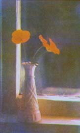
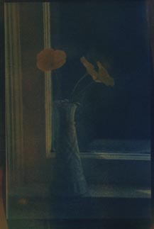
An easy way to test the neutrality of color balance is to print the three color layers from one black and white negative. If the pigments are balanced properly, the resulting print should be in shades of neutral grey and black. If not, you could get something like this:
This is a combination of PY110, ultramarine, and PV19 gamma. Drawing a mixing triangle on the CieLab color wheel with one of these pigments at each corner of the triangle, the area of the triangle does not include the center of the wheel (black); in other words, theoretically at least, these three pigments when mixed cannot produce black, and this practical demonstration seems to indicate that in this case, the theory is correct. This particular version of PV19 gamma would do better with pthalo (PB15:3) and PY 97 as companion colors.
If the triangle encompasses the center of the wheel, the three pigments in balanced proportions should produce black when overlaid, although slight adjustments in the pigment concentrations of each may be required to ensure a perfectly neutral balance.
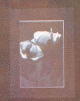
Lest you be concerned that this is an insurmountable difficulty, let me assure you that I started printing tricolor years ago by the seat of my pants and found a good balance right away; I only learned this stuff above in the last few months, after printing tricolor gum successfully for the better part of two decades. I doubt it's that I was incredibly lucky in my initial choice of pigments, but that it's just not that hard. Here's an early tricolor that's mostly a neutral grey (with some green reflected light from leaves).
See also a discussion at a separate page debunking the myth that black can't be produced with three colors.
Printing Order: If three printings leaves you with a slight color cast, one more printing of the opposite color may be necessary to bring the print into balance. In my experience, it's easier to get the color balance and tonality right on the first try if you print the cyan layer last. This is consistent with thinking of a tricolor print as a 3-dimensional object rather than three two-dimensional layers on top of each other. For me, printing the cyan layer last allows you to think of the last layer not just as a layer in and of itself, but as the layer that pulls together the three-dimensional print; while watching that last layer develop you're judging all three layers together at once and how they work together. Since the cyan layer provides so much of the tonal structure of the print, it works best IMO for the cyan layer to be that layer that pulls everything together at the end.
Is it possible to reproduce the entire spectrum accurately, using three pigment layers? I hadn't ever wondered before whether there's a combination of three pigments that will render every possible color exactly accurately, because precisely accurate color rendition has never been my goal. But preparing to write this page, I've spent some time studying the handprint pages on color mixing;
http://handprint.com/HP/WCL/color13.html#mixingsteps
According to this information, it's not possible to mix all the colors in the color wheel accurately using three colors, and to get a more complete and accurate color palette, or gamut if you will, one is advised to use six colors, primaries and secondaries together, if one wants accurate color throughout the range of hues and values. I haven't tried this and don't know if I will, because it seems like a lot of work.
The issue is that while theoretically and for ease in representation, the primary colors are represented as equidistant on a "color wheel," they are not practically equidistant in terms of color mixing with paint; the red and yellow are closer together than either of them are from cyan. So when you use three primaries, you lose some vividness in the mixed greens and in the mixed violets as compared to the mixed oranges. This is true for color mixtures obtained by overlaying the primary colors, as in gum printing, as well as for mixing the paints. So the only way to reproduce precisely accurately all available colors is to print with six pigment layers, including pigments with hues between the primary colors.
My own feeling about this is that most gum printers don't come to tricolor with the goal of finding a way of making accurate color reproductions, and those who do should be prepared for some difficulty. But for those of us who are satisfied with a reasonable approximation of realistic color, three colors are quite adequate. And as far as I'm concerned, reproducing colors realistically isn't the most interesting thing to do with gum; far more evocative and interesting is to interpret and express the colors in a completely creative way.
Transparency: Another important consideration in choosing pigments for tricolor gum is transparency vs. opacity, which I explain in depth on a separate page. The implication for the appearance of a finished tricolor should be clear from the visual I provide there. There's no "right" or "wrong" to it, just different looks. I prefer the transparent look, and I tend to print tricolors exclusively with transparent pigments.
I generate my color separations digitally from the RGB file, by inverting and separating the channels and outputting to inkjet on transparency. On a separate page I have a technical discussion of how the RGB values in the original file are naturally converted to CMY values when the file is inverted and the channels separated, if you're interested in following that through.
Curves:
Historical note: since most of my tricolors were made before decent inkjet printers were developed, 90% of my tricolors have been printed from bitmap negatives printed from a laser printer on laser transparencies. Perhaps that's one reason I've been very skeptical of the current preciousness about inkjet printers, inksets, curve systems and all that arcana about generating the perfect digital negatives for tricolor printing. Even today, the best new work (in my opinion, of course) is being done by people who arent doing any of that. For example, Jim Larimer's tricolor work, with all three colors printed from one laser printed negative, no curves:
http://www.hybridphoto.com/gallery/showimage.php?i=442&catid=member&imageuser=935
and Keith Gerling's gorgeous work, still done as far as I know without curves:
http://www.gumphoto.com/masa/index.htm
The best contemporary method I've found for generating curves for inkjet negatives is Michael Koch-Schulte's RNP method using Kevin Bjorke's open source ChartThrob to generate the curves:
http://www.inkjetnegative.com/images/RNP/quick_guide_to_making_digital_ne.htm
I recommend it highly: it's explained in an engaging, easy to understand style; it works, and it's free. But don't go into curves generation thinking that learning curves is all you need to create a perfect tricolor print, 'cause that aint' gonna happen. While curves might help refine a process that's already producing good tricolors, curves aren't a crucial element for successful tricolor gum printing, as is shown by all the excellent tricolor gum prints made without them, and the really bad tricolor gums I've seen made with them.
Some examples of tricolor gum work:
Keith Taylor (who prints for Cy deCosse): http://www.johnstevenson-gallery.com/artist.php?file=decosse.xml
(warning): very slow downloading (at least it was for me)
Jim Larimer: http://larimerphoto.blogspot.com
Keith Gerling: http://www.gumphoto.com/masa/index.htm
Hamish Stewart: http://www.gumphoto.co.uk/
Dave Rose: http://www.alternativephotography.com/artists/dave_rose.html
Mary Dorsey: http://www.alternativephotography.com/artists/marydorsey_wanless.html
Copyright Katharine Thayer, all rights reserved