Pigments can be roughly divided into two groups based on whether they are opaque or transparent in nature. This is a slight oversimplification, because there is a continuum rather than two discrete groups, but it's not too hard, if one looks closely at the behavior of the pigment, to decide whether the pigment belongs in the transparent category or the opaque category.
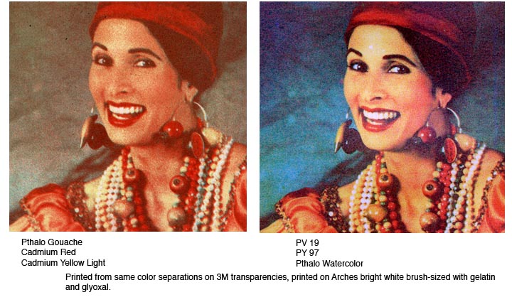
The two types of pigments give a different look in a multiple gum print. Transparent pigments produce bright, luminous, jewel-like color blends, while opaque pigments give a duller, cloudier look, in my experience. Here I've printed the same image in tricolor, once in opaque pigments and once in transparent colors. I took a detail less than 2 inches square from the prints and enlarged them so you can see more clearly the difference between the two kinds of pigment:
To place some pigments on their appropriate sides of this distinction: Cadmium yellows are opaque; hansa and azo yellows are more transparent. Quinacridone reds are quite transparent; cadmium reds are quite opaque. Of the blues, pthalo is the most transparent, ultramarine quite transparent, cobalt less transparent, and cerulean quite opaque. Of the earth pigments, yellow ochre, raw sienna and raw umber are quite opaque; burnt sienna can be fairly transparent depending on brand, and burnt umber is generally somewhere between. For reasons unrelated to the pigments themselves, but to the type of paint and how it is mixed, gouaches are by definition more opaque than transparent watercolors, regardless of the pigments used.
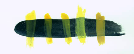
Here are some yellows, brushed across lamp black to reveal their relative transparency or opacity :
From left to right, the yellows shown are PY110 (the yellow I use exclusively), PY 153, PY108. Then comes a hansa yellow (PY3) in gouache, and finally, yellow ochre.
Whether one chooses opaque or transparent pigments is completely a question of personal preference. For quite a while I've preferred printing with transparent pigments, because I love the luminous color blends that can be achieved this way, and it's no accident that my yellow of choice is the most transparent of the sample above. But someone to whom opacity is more important than luminosity might well choose yellow ochre, and I can think of instances where a veil of a semi-opaque light color over dark, such as with the yellow gouache above, might be just what's needed to give a particular effect. The point is to understand the characteristics of the different pigments and use them accordingly.
The most common misunderstanding about transparency and opacity is the assumption that opacity is a function of pigment density. I suspect this misunderstanding arises because people who come to gum printing from silver-gelatin printing have an equation engraved in their brain cells that relates density to opacity. This equation is true for the silver compounds used in traditional photographic work: density = log opacity; in other words, the denser the silver compound, the more opaque to light, and the darker the tone. But in gum printing, this equation doesn't work, because in gum printing, the density of the reaction product is only indirectly related to the tonal value. In gum printing, opaque pigments can be very light and transparent pigments can be very dark.
Take PY110, the far left swatch in the illustration above, and the hansa gouache, second from right. The two are about the same in tonal value but one is very transparent and the other is quite opaque. And pigment density (pigment concentration) is extremely variable depending on the strength of the pigment (more about pigment strength on the main pigment page) and is not related to either opacity or to tonal value.
It's true that most opaque pigments mixed at gum printing strength will allow much of the underlying color to show through, by virtue of the simple fact that the pigment molecules are dispersed in the gum, but this doesn't change the fact that the pigment by nature is opaque, and as can be seen in the tricolor details at the top of this page, opaque pigments impart a cloudiness, a haze, to the print that transparent pigments don't. Whether an opaque overlay or a transparent overlay is more desirable depends entirely on the desired effect. If the desired efffect is a misty veil of color that sort of shows and sort of hides the underlying color (again, refer to the hansa gouache on the sample above for an example) then the opaque pigment might be exactly the right choice. But if you want the overlying colors to blend with the underlying colors to create a luminous print, you will want to consider transparent pigments.
As can be seen in the page on gum and tonality, transparent pigments can be printed as dark as opaque pigments; in other words, the assumption that transparent pigments will always be lighter in tone than opaque pigments is just simply wrong.
Transparency vs opacity, I should clarify, is an issue especially when printing colors over other colors. While a single-layer gum can be seen on inspection to be transparent or opaque, it's only in multiple gums that this quality becomes crucial in determining the character of the print.