First, let me say in advance that I don't believe in a "correct" tonality or contrast for a gum print, or for any photograph for that matter. One of the many amusing things that's happened to me in my time on the internet, was when a well-meaning person wrote me to say that there's something wrong with my calibration or something, because some of the images on my website look "right" and some of them look way too pale and low-contrast. I laughed and wrote back and said, "No, there's nothing wrong, that's how it's supposed to be." The gallery page will give a better idea of how I've used gum to print different tonal ranges to achieve very different artistic goals at different periods, mostly by simply adjusting the pigment concentration.
The point is that there isn't any "right" tonality for a gum print to have, and the main point of this page is that whatever tonal range you have in mind for a print, in order to use gum to your advantage and work with it instead of having it work against you, you need to take into account the characteristics of the printing mix and its effect on tonality.
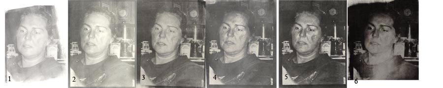
Pigment concentration and tonality: As I explain in the page on exposure, each particular gum coating mix, under a particular set of conditions (paper, light source, etc etc) yields a particular tonal profile that can be fully realized, but not altered, by decisions about exposure and development. First, and in my opinion paramount, is the general principle that DMax and visual contrast vary directly with pigment concentration. To illustrate this long-established gum truth, here are a series of prints made using increasing proportions of PBk11 (iron oxide black) which has become my favorite black, using the same negative.
Because there's so much misinformation circulated about gum and tonality, let me emphasize at the outset that exposure is not an issue here. For each mix, except for mix #6, the exposure for each mix was determined to ensure not only the maximum DMax for each coating mix, but also the maximum number of steps each mix was capable of retaining. Mix #1 could never produce print #3, 4, or 5 by exposing more; it could only produce a print that looks just like print #1, but which would take considerably longer to develop its optimal tonal range as shown. And by the same token, the prints from the higher pigment mixes could never be made into print #1 by underexposing; the dark print would simply wash off the paper rather than lightening to paleness, and the mix could never be made that low-contrast anyway. Also, each mix has its own signature quality of smoothness of tonal gradation or lack thereof, as I'll show with some closeups in a minute. Bottom line, prints made with different mixes simply can't be made to simulate each other by any means, including adjusting exposure and development.
Below are reflection density readings as measured directly from each print (the actual print, not the scanned file).
| darkest tone | midtones | lightest hilight | range of face tones | |
| 1. | .60 | .35 | .10 | .12-.28 |
| 2. | .72 | .45 | .10 | .12-.40 |
| 3. | .95 | .65 | .20 | .24-.50 |
| 4. | 1.00 | .75 | .25 | .24-.50 |
| 5. | 1.05 | .85 | .30 | .30-.60 |
| | | | | |
| 6. | 1.25 | 1.00 | .25 | .40-.75 |
Prints 1-5 were still-developed to a standard time. Print #6, which was made especially heavily pigmented to give a deep DMax, (I was trying to determine the darkest DMax I could print with this pigment) doesn't really count in the comparison because the efforts to give it any tonal range at all were extreme and not very effective. (After still-developing for two hours, it was blasted for 10-15 minutes with water from a high-pressure faucet, first cold then hot, soaked in ammonia, and brushed hard with stiff brushes.) What tonal variation there is was wrested from the darkness by sheer determination and cussedness and doesn't really count as photographic tonality. This mix would be much better printed as a short-exposure printing with a high-contrast negative, to fill in the deepest shadows without darkening midtones or highlights (another well-established gum tradition). But this also offers a hint as to why so many early pictorialist gum prints look the way they did, as if they were taken at midnight in a coal cellar (as George Bernard Shaw is famously said to have described them), because they were often overpigmented and overexposed and forcibly developed by various means. This is not to denigrate this way of working; some very beautiful low-key prints have been made this way, only to point out that this is the way to go if that's a look that interests you.
The shortest ranges here, .50 and .62, are for the two lightest mixes, which makes sense because their DMax is severely attenuated by the low proportion of pigment; if DMax is attenuated on one end, range is attenuated by definition if the other end of the scale is already up against white. The three more concentrated mixes (that were normally exposed and developed) all give a tonal range of .75. (And I didn't choose the numbers to make it come out neat that way, honest; I carefully read the lightest and darkest tones in each print and wrote down the readings; it was only after I made the table that I saw that the ranges came out the same.) What the increasing concentrations do is just take that range and move it down the scale.
(Note: the negative used for the prints in the above comparison was one which set the highest highlight below paper white; had I used a negative that allowed for printing paper white, there would have been paper white in two or three places in each of the prints, which would have increased the apparent contrast of the darker prints. But since what we're concerned with here is the tonal range, defined as the distance between the lowest and highest printed tones, not the difference between the darkest printed tone and paper white, the absence of paper white needn't concern us, although it's true that greater drama can be achieved by including paper white tones in a print that uses a fairly saturated pigment mix.)
Smoothness of tonal gradation and pigment concentration: Besides affecting DMax and contrast, increasing pigment concentration has a marked effect on smoothness and subtlety of tonal gradation; as pigment concentration goes up, smoothness of tones and of tonal gradation goes down and the print, especially in highlights and lighter midtones, becomes visibly more grainy and tonally jumpy. Below I've taken a detail from each of the prints above to make that point more clearly.
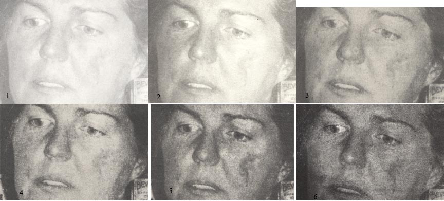
This is one profile of one pigment; since pigments are all different, while we can assume (and my experience certainly indicates) that the same general rule holds for all pigments, the reflection density ranges produced by the different pigments and different pigment concentrations will be very different.
The coarseness of the highlights printed with a heavier pigment mix is another reason to consider multiple printings with different pigment concentrations, if you want to print the darkest possible DMax, open shadows, and smooth highlights with subtle gradations. You can't get both in one printing (as I keep saying, you can have either drama or subtlety in one gum printing, but never both) so it makes sense to follow the advice of great gum printers from the past, and use two printings to cover the scale and get both smooth highlight gradations and deep shadows; the visuals above show why that is the case. More about that under "tonality and multiple printing" below.
A brief note re curves and gum tonality: A lot has been made of the use of digital negatives and the calibration of curves to refine gum printing technique. The thing is, curves can only get you so far. Curves can redistribute tones within the tonal profile of a particular mix, but cannot change the inherent constitution of the pigment mix, so even if you used curves to lighten the midtones printed with mixes #4 and #5, for example, the darkest and lightest values would remain the same, and the lighter midtones and highlights would still be coarse and grainy rather than smooth, because that's the inherent nature of the mix. Another, even more crucial thing you can't do with curves is to extend the tonal range of a particular pigment mix. You can redistribute the tones to some extent within the range of the emulsion, and if you really wanted to, you could shorten the range by making the negative dense enough to print paper white at the lighter or darker end of the range. But you can't make it longer, and you can't, by applying curves, create a gum print with deep DMax and also meltingly smooth highlight transitions; it's not in gum's nature to do that. The mix at hand can only do what the mix at hand can do.
Note: I've been watching the alt-photo list discussions about bleach-development, and was persuaded at first that this might be the way to a longer smoother scale in one coat, even though I simply haven't been able to make it work for me, but when I was able to see a print in person and measure its densities, I was disappointed to find the method didn't produce a longer tonal range than traditional methods. It was essentially a print of the one-coat type recommended above, where all the tones were essentially in the midtone region, with a couple of shadow tones and no highlight tones. Since there were no tones light enough to really be called highlights, it was hard to tell if this method would produce smooth highlights. I'm keeping an open mind, but am not persuaded yet.
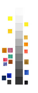
Tonality and pigment hue: Because the tonal values in a gum print are expressed entirely in pigments, a brief consideration of the relationship between color and tone seems appropriate here. People who have worked in black and white often have a better understanding of this relationship than those who have always worked in color. As shown on the color/value chart below, and as is probably self-evident, different colors occupy different parts of the tonal scale. The pigments on the left side of the value chart are transparent pigments; those on the right are opaque. Note that both transparent and opaque colors span the gamut from light to dark.
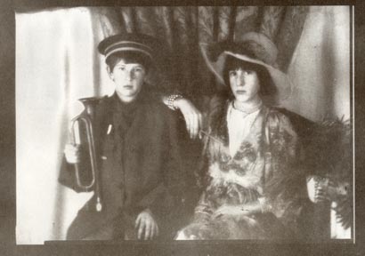
Tonality and one-coat printing: The best compromise for a one-coat gum print, in my experience, is to choose a middling pigment concentration that will provide good separation in the midtones, such as mix #3 or #4 in the comparison above. With such a mix, the darkest midtones appear darker in comparison than they actually are, and look like "open shadows", even though they hardly qualify as shadows in the usual sense. The lightest tones won't be smooth and subtle, but it's a compromise that has worked well for me and for many gum printers; it's the closest we come to simulating a "full tonal scale" in a one-coat gum print. Here's an example in ivory black, which prints as a lovely rich chocolate brown in a middling concentration:
Tonality and multiple printing: But if you want to print an actual long scale that's nicely separated throughout its range, heed a gum truth that's been passed down from gum printer to gum printer and proven true by each new generation of gum printers: there's only one way to achieve a longer tonal scale than gum can print in one coat (around .75 as shown above) with tonal subtlety in shadows, midtones and highlights, and that is to use multiple printings. A three-layer print with a light pigment mix to provide beautifully smooth and subtle highlight tones, a medium mix for good separation throughout the midtones, and a deep mix to fill in the darkest shadows, should give you a beautiful print with lovely separation and smooth gradation throughout a tonal range of 1.3 or more. (I once measured a DMax of 1.8 from a heavy mix of PBk11, but that was with a borrowed densitometer; I haven't been able to get the same reading again, even from the same print, and now am inclined to think that was an incorrect reading). The best way to do this is to print the heaviest mix with a short exposure time so as to print only the darkest shadows and leave the midtones and highlights clean for filling in with the smoother tones of the lighter mixes.
Terminology: Gum printers haven't had a tradition of using precise terminology to refer to tonality, and a very common but very confusing usage is to employ the words "shadow," "midtones" and "highlights" to mean the darkest, middlish, and lightest values in a print, regardless of the absolute tonal values. How much sense does it make to talk about "shadows" in a print where the darkest value is .45 or .60? We need to have a way of talking about tonality in an absolute rather than relative sense, and I've settled for the moment on reflection densities as a good place to start. These can be measured either using a densitometer, or using a scanner program using a standard reflection step wedge to double-check the accuracy of the readings. Don't get me wrong, this kind of measurement is not required, or even recommended, for the making of gum prints. But it does help clarify discussions about tonality and gum printing.
If we arbitrarily break the total available tonal scale into what would normally be called shadows, midtones and highlights, I'm not sure there is general agreement about where exactly to draw the boundaries, but for the purpose of judging the tonality of gum prints, I like to break it out this way: to be legitimately called a "shadow," the reflection density should be at least .85 or .90. To be order to be called a highlight, the density should be at most .20 or .25. Again, this is arbitrary and subjective, but that's where I draw the distinctions. The one-coat gum print of my children (just above) covers the midtones well but has no tones above .90 and the one or two tones below .20 are grainy and jumpy. What I'm talking about achieving with multiple printing is a gum print that runs smoothly, with open and subtle gradation from 1.2 or 1.3 at least, all the way to paper white.
See also: Gum and contrast.
Copyright Katharine Thayer, all rights reserved