Myth: Gum prints are coarse and can't show subtle tonal gradation
This myth is related to the myth that gum can't show detail. The early gum printers tended to print gum on textured paper and with lots of pigment, to achieve a pictorialist style where details and subtleties of tonal gradation were deliberately obscured. Many folks with little understanding of gum have assumed that the pictures must look that way because that's the way gum prints look; in other words, they assumed it was something about the gum process itself that created that look. As a result the myth arose that gum was inherently coarse and couldn't express subtle tonal gradations, especially in the lighter portion of the tonal range. As more people are printing gum in a more contemporary style, this misconception is fading.
As to the question of smoothness of texture and subtle tonal gradation in gum, I suppose it depends on how fine you want to draw your distinctions. Perhaps gum will never print as smooth and subtle as some other processes, but it's capable of more smoothness and subtlety than many people have given it credit for. An example to illustrate the point below; for another one see this tricolor:

As explained in the page on tonality in gum, the key to subtle tonal gradation, especially in the highlights, is a fairly light pigment mix; the key to a smooth print is a smooth paper.
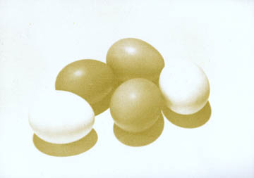
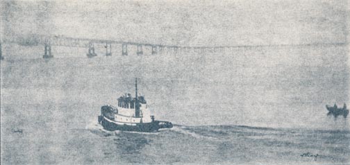
Here's one image printed two different ways, to show two points on the continuum of coarse-smooth possibilities:

This is an example of some of my early gum work, when I was working in a more pictorialist style. The key to this traditional look is a heavier pigment mix and coarser paper. The paper is the back side of Arches traditional hot press, maybe not as textured as most cold press papers but more textured than the paper below.

This is another way to print the same image. Smoother paper, less pigment. It gives a more photographic, less "gumlike" appearance.
Copyright Katharine Thayer, all rights reserved.